- accessibility
- design
- layout
Scale your images with Dynamic Type
 Sofia Larsson
4 min read
Sofia Larsson
4 min read
If you’re aiming to make your app accessible, you’re probably already supporting Dynamic Type for your copy, likely by using different dynamic text styles. But what about image assets that, unlike system images, don’t automatically scale when the text does?
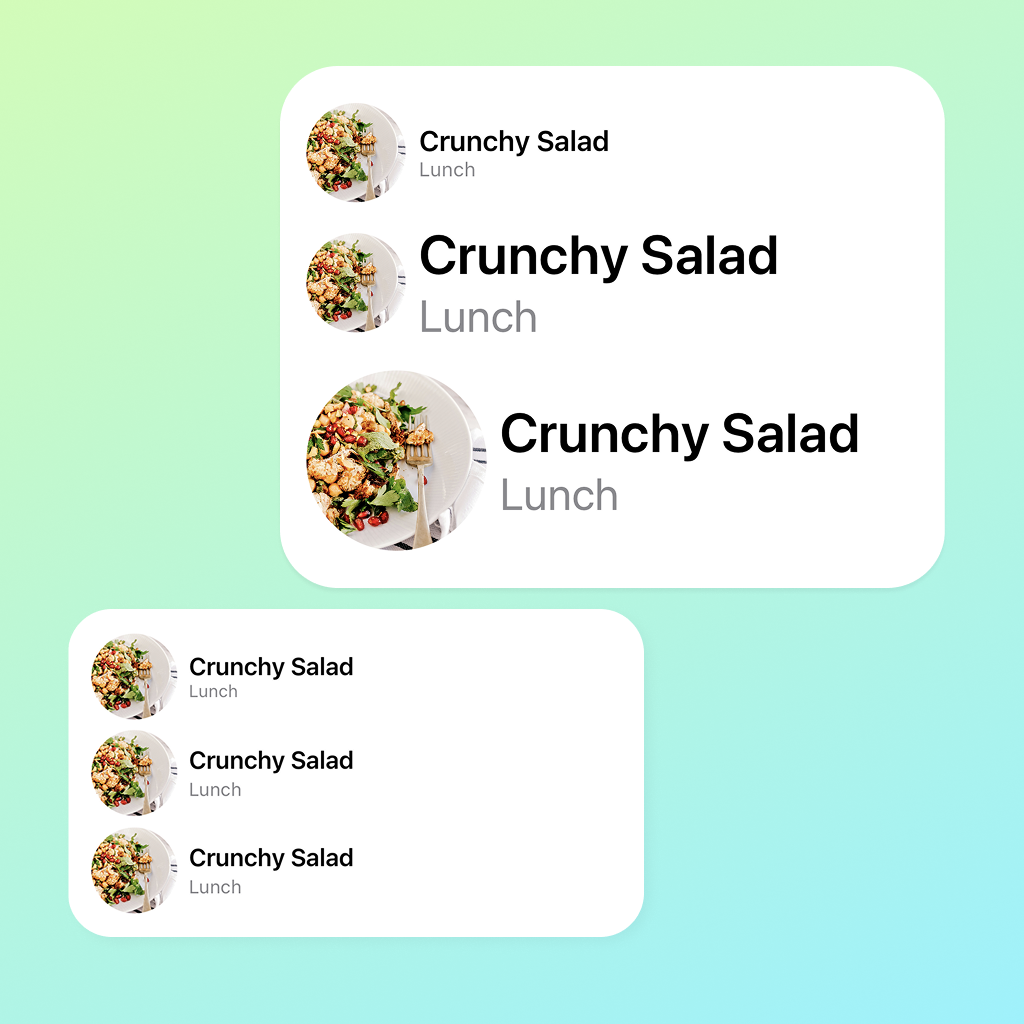
Here are three ways of showing the same text and image, at three different Dynamic Type sizes: 100%, 80%, and 190%.

When using the default setting, 100%, the image and text sizes are the same across the rows. When we change the setting to 80%, there’s a slight change in size, but when switching to an accessibility size, AX2 190%, you can really see how unbalanced the image and text are next to each other on the second row.
Let’s take a closer look when Dynamic Type is set to 190%, and break down the differences between each row.

In the first row, we’re using fixed values for both image and text. The layout remains balanced if the user changes their Dynamic Type settings, but that doesn’t matter if the user can’t use your app properly due to impaired vision.
The second row is more accessible, using dynamic text styles, but it looks off with such a small image next to the big text.
How can we keep the layout balanced and make it accessible?
In the third row, we’re using both Dynamic Type and something called ScaledMetric, a property wrapper that scales a value based on the environment. Scaled metric values can be used not only for images, but also for paddings, shapes, frames, and more — wherever a scalable value is needed.
Note!
If an image is purely decorative, i.e. doesn’t bring any other value to the user, it is often best to omit it completely to allow more space for text.
How do we implement it?
Set a standard value you want to use as the default size. This value will then scale depending on the user’s Dynamic Type setting.
@ScaledMetric var imageSize: CGFloat = 60
If the image is tightly connected to a text element, like in the examples above, I personally prefer that the image scales with the font for that text. Simply add the relativeTo parameter to do that.
@ScaledMetric(relativeTo: .body) var imageSize: CGFloat = 60
Below is a cheat sheet of Dynamic text styles for iOS and iPadOS, highlighting the device setting and style used in the examples above.

Design resources from Apple, like this Figma asset, can be found here.
Tip!
Experiment with different fonts and compare the edge case results, you’ll be surprised how much they differ from one another.
Summary
Use Scaled Metric to scale your images, paddings, shapes, and more with Dynamic Type to maintain a balanced layout. But keep in mind that legible and untruncated text should always be the priority.
Scaled Metric scales differently depending on the font type it is relative to.
Code assets
@ScaledMetric(relativeTo: .body) var imageSize: CGFloat = 60

var body: some View {
    VStack(alignment: .leading, spacing: 32) {
        staticSizeView()
        dynamicFontSizeView()
        scaledMetricView()
    }
    .frame(maxWidth: .infinity, alignment: .leading)
}
First row - Fixed values
@ViewBuilder
private func staticSizeView() -> some View {
    HStack {
        Image("Example1")
            .resizable()
            .scaledToFill()
            .frame(width: 60, height: 60)                     // Fixed values for the frame
            .clipShape(Circle())

        VStack(alignment: .leading) {
            Text("Crunchy Salad")
                .font(.system(size: 17))                      // Fixed values for the font size
                .fontWeight(.semibold)
            Text("Lunch")
                .font(.system(size: 12))                      // Fixed values for the font size
                .foregroundStyle(.secondary)
        }
    }
}
Second row - Fixed image, dynamic text
@ViewBuilder
private func dynamicFontSizeView() -> some View {
    HStack {
        Image("Example1")
            .resizable()
            .scaledToFill()
            .frame(width: 60, height: 60)                     // Fixed values for the frame
            .clipShape(Circle())

        VStack(alignment: .leading) {
            Text("Crunchy Salad")
                .font(.body)                                  // Dynamic text style
                .fontWeight(.semibold)
            Text("Lunch")
                .font(.footnote)                              // Dynamic text style
                .foregroundStyle(.secondary)
        }
    }
}
Third row - All dynamic
@ViewBuilder
private func scaledMetricView() -> some View {
    HStack {
        Image("Example1")
            .resizable()
            .scaledToFill()
            .frame(width: imageSize, height: imageSize)       // Scaled metric instead of fixed values
            .clipShape(Circle())

        VStack(alignment: .leading) {
            Text("Crunchy Salad")
                .font(.body)                                  // Dynamic text style
                .fontWeight(.semibold)
            Text("Lunch")
                .font(.footnote)                              // Dynamic text style
                .foregroundStyle(.secondary)
        }
    }
}
Written by
Sofia Larsson